Home Work About

UXfol.io

How discovering a user problem led to a major product pivot.

Product overview

UXfol.io is a web-based platform helping designers build their case study-focused portfolios. I contributed to early research and helped define the product’s direction, later taking over its design a year after its initial release.

Problem

Users felt their portfolio pages were hindering their ability to stand out and land a new job.

Solution

We introduced customizable portfolio templates, allowing personalisation to help them showcase their individuality.

Year

2019

Platforms

Web

Role

Design, Research

Tools

Sketch, Axure

Check product

The problem

Users’ perception didn’t match our product

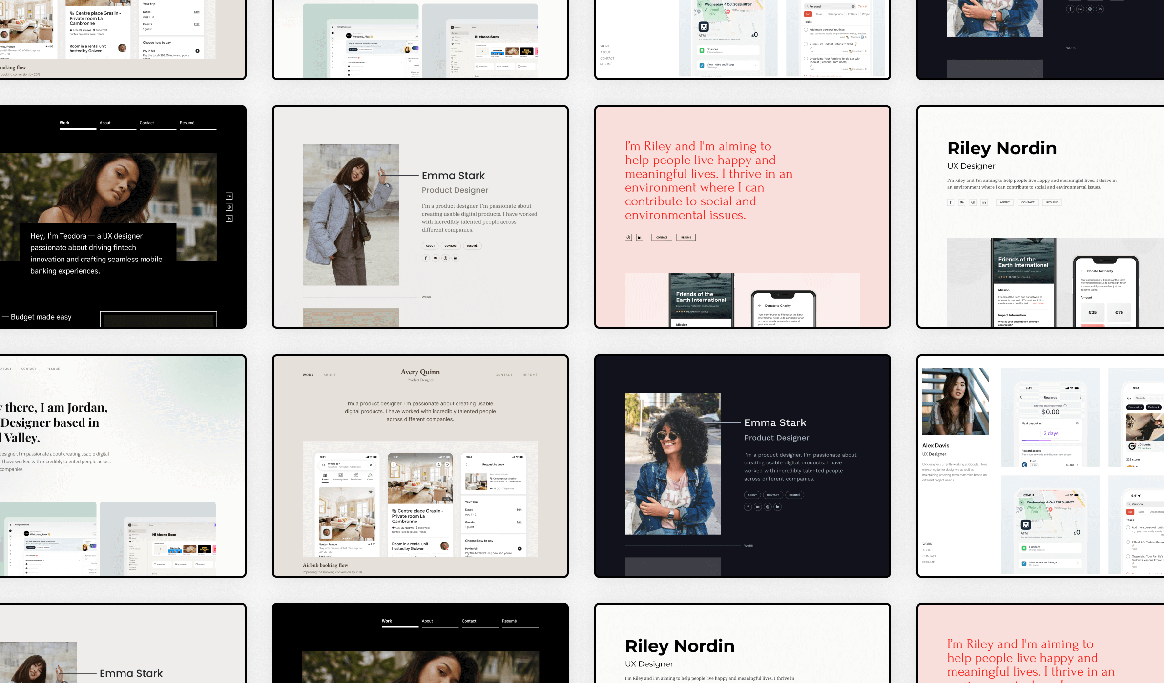
We imagined ourselves as a case study-centric Behance or Dribbble (i.e. as a platform having profiles and case studies), however, it became clear that users saw us differently. Our users felt the lack of portfolio customisability hurt their interview chances; We were focused on simplifying case study writing, not anything else surrounding it—a huge oversight on our part.

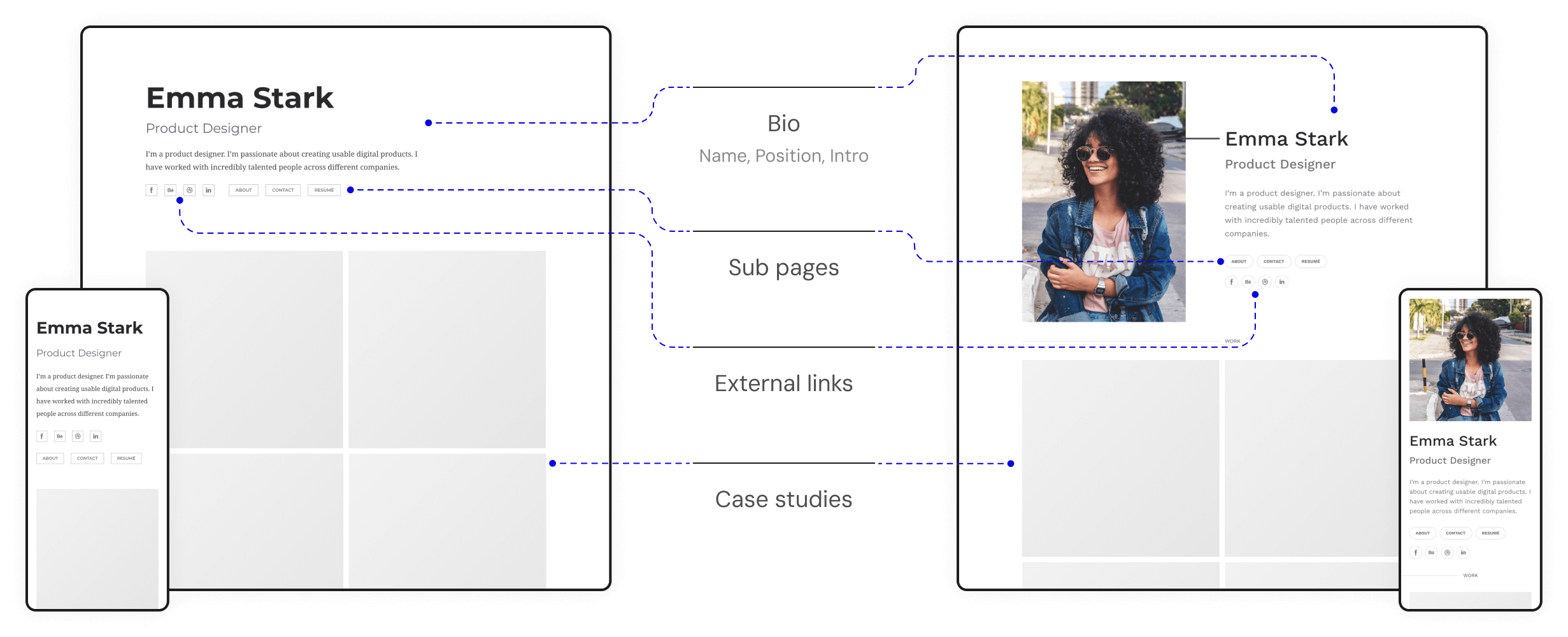
Portfolios on the platform have two main parts:

We called the first one profile but our users called it home page. And the difference in perception was the core problem: While you wouldn’t want to customise a profile, you definitely want to make your homepage unique.

It was clear we need to change how we treat the profile page. However, this shift was about to introduce unanticipated development efforts, turning our roadmap upside-down, so stakeholder buy-in was a challenge.

The process

Building a case for stakeholder buy-in

UXfol.io was a tiny team and besides design, I was responsible for user research, took part in customer support and monitored our community. I kept seeing this user problem so I had to make sure the team is as much exposed to this user pain as me.

User feedback from various channels

In just a couple of weeks it was evident: customisation swept the board. The latter eliminated the recency bias, which also helped me make sure this project worth fighting for.

Additionally, the product already having an editor for the case studies helped in the campaign: we don't have to build something from scratch, we just needed to adapt existing functionality.

Launching the portfolio template MVP

Continuous exposure to the subject and the numbers did the trick: the portfolio template project was greenlit. I had a highly flexible home page editor in mind, because I knew that no matter how many different templates we create, it won't solve to core issue of wanting to stand out fully. However, we needed to ship an MVP to validate the portfolio template idea and fuel later iterations:

With these restrictions I designed 2 new responsive portfolio templates. I kept the design minimal to let the work of our designer's shine but injected a bit more personality than our current 'profile page' had.

Designing for scale

While the launched MVP was very rigid I designed them knowing they could be editable in the future. I expanded the design system with specific content blocks and UI elements and set rules generic font styles and colour palettes for each template. With this approach developers could prepare for future editable capabilities and it also helped eliminating guesswork when designing new templates.

The release

Instant positive feedback from users

Majority of our active users switched to one of the new templates shortly after release and most of our new users started with one of the new ones. The user reception also helped propel this feature further: we kept on adding new templates and adding features to each slowly reaching my initial idea of the home page editor.

Portfolio Template - Customized Portfolio

Iterating on the MVP

In the second template release we added 4 more and expanding the number of templates helped users find a design they resonate with. We also added the template selection to the onboarding process, which helped users connect to their portfolio better even before putting any real work into it.

Reflection

Okay, let’s retro…

UXfol.io was my very first non-client product and I have come a long way since. Research mostly meant interviews and usability tests, since we lacked structured product metrics and usage analytics.

What I’d do differently, this time around:

before the project

Survey active users to:

After Launch

Measure the impact by:
Personalisation options made possible later, reaching the initial vision for the portfolio templates

Something extra ✨

Other projects during my time at UXfol.io

We always kept tabs on features users kept requesting, and there were projects I initiated by monitoring published portolios on the platform to identify features to build.

Each of these features are still live and loved by the users on the platform.